PAC VRDC Management Dashboard
Overview
The Management Dashboard provides a detailed view of your network and individual facilities. Use it to move from high level performance insights to facility level analysis, identify facilities that meet specific criteria, and customize the information displayed for your review.
The Management Dashboard allows you to:
-
Review network level snapshots
-
Build custom facility filters
-
Identify how many facilities meet selected criteria
-
Save and reuse frequently used filters
-
Customize which columns display in the grid
-
Export facility information to Excel
-
View facilities geographically on an interactive map
Selecting Your Care Type
At the top of the dashboard, select the type of care you want to review:
-
Home Health
-
Skilled Nursing Facilities (SNFs)
The information displayed will change based on your selection.

Using the Filters
The Management Dashboard includes three primary selections:
-
Data Period
-
Network
-
Network Period
These selections determine the data and network information displayed throughout the dashboard.
This flexibility allows you to compare performance in the way that is most meaningful to your organization.
Data Period
-
The Data Period determines the period of performance data being displayed.
-
Data Periods currently extend through Q4 2025. As new data sets become available, additional quarters will be added to the dashboard.
-
Data displayed represents a rolling 12-month period ending with the selected quarter.
-
For example, selecting Q4 2025 displays data representing the rolling 12 months through Q4 2025.
-
-
The available Data Periods will be updated over time as new data becomes available.
Network
The Network filter allows you to choose which providers or facilities to include:
-
In Network
-
Out of Network
-
All (This includes both in network and out of network)
Network Period
-
The Network Period determines which version of your organization's network is used for the comparison.
-
Network information is based on the in-network file provided by your organization. The Network Period dropdown reflects what your organization's network looked like during the selected period.
Data Period and Network Period serve different purposes:
-
Data Period determines the period of performance data being reviewed.
-
Network Period determines which facilities were considered in network during that period.
Network Snapshot
The Snapshot provides a quick view of key network statistics for the selected care type, Data Period, and Network Period.
The snapshot includes:
-
Number of facilities in network
-
Admissions
-
Average HCC
-
30-Day Rehospitalization %
-
30-Day ER %
The Network Snapshot will remain the same as you work through the Management Dashboard unless you change the Data Period or Network Period.
This provides a quick way to understand the overall network before moving into facility level analysis.
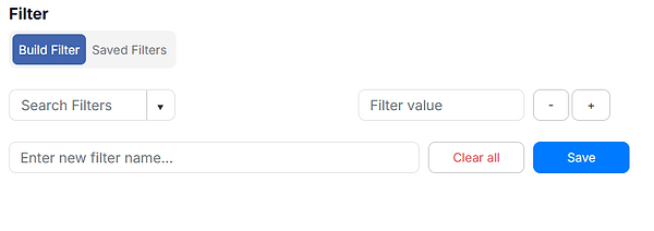
Build Filters
The Build Filters section allows you to create a customized group of facilities based on the criteria that matter most to you.
Start by selecting a filter from the first dropdown. A related sub filter will then appear, allowing you to further define your selection.
You can combine multiple filter lines to create a more specific facility population.
Filter Types
The type of selection available will depend on the filter you choose.
For broader categories, such as Region or County, an additional dropdown will appear so you can select the appropriate value.
For more specific criteria, such as Facility Name or CMS ID, a free-text field will appear so you can manually enter the information.
Add or Remove Filters
Use the + and − options to manage your filter lines.
-
+ adds another filter line.
-
− removes a filter line.
Adding additional filter lines allows you to narrow your facility population by applying multiple criteria.
Funnel Display
As you build your filters, the Funnel Display provides a visual representation of how many facilities meet the criteria at each step.
Each additional filter narrows the facility population.
This allows you to see how your facility population changes as additional criteria are applied.
Identified
Identified provides a quick snapshot of the total number of facilities that meet all of the filters you have selected.
Use this number to quickly understand the size of the facility population identified by your filter criteria.
The Identified count updates as you add, remove, or modify filters.
Save Your Filters
If you regularly use the same filter criteria, you can save the filter configuration for future use.
To save a filter:
-
Build your desired filter criteria.
-
Enter a Filter Name.
-
Select Save.
Your saved filter will then appear under the Saved Filters tab.
Saving filters can help you quickly return to commonly used facility populations without rebuilding the filter criteria.
Saved Filters
The Saved Filters tab displays filter configurations that have previously been saved.
From this tab, you can:
-
Run a saved filter
-
Delete a saved filter that is no longer needed
Saved Filters make it easier to reuse frequently desired data set.
Column Display
The Column Display dropdown allows you to customize the information
shown for each facility that meets your selected filter criteria.
You can choose which columns are visible or hidden based on the
information you want to review.
The eye icon means the data will be displayed in the grid.
The eye icon with a slash means the data will be hidden in the grid.
Just like in the Executive Dashboard, options will be different
based on which data you are looking at: Home Health vs. Skilled Nursing Facility
Export to Excel
Select Export to Excel to download the facility grid and its available information for additional analysis or reporting.
Facility Map
The Management Dashboard also includes an interactive map that displays the facilities identified by your selected filters.
Each facility is represented by a pin on the map.
Network Overlay
You can customize the network information displayed on the map by selecting:
-
In Network
-
Out of Network
-
Both
This allows you to visually compare the location of in network and out of network facilities.
Map Center
You can choose where the map is initially centered.
For example, if your organization has facilities concentrated in two major cities, you can choose to center the map on the city with the largest number of facilities.
This can make it easier to begin your review in the geographic area most relevant to you.
Navigate the Map
The map is interactive. You can:
-
Zoom in to view facilities more closely
-
Zoom out to see a broader geographic area
-
Scroll to move around the map
-
Hover over a facility pin to see which facility the pin represents
The map updates to reflect the facilities identified by your selected filters
Using the Management Dashboard
The Management Dashboard is designed to help you move from a broad network view to a specific group of facilities or individual facility.
A typical workflow is:
-
Select Home Health or Skilled Nursing
-
Select the Data Period
-
Select the Network
-
Select the Network Period
-
Review the Network Snapshot
-
Build filters to identify the facilities you want to analyze
-
Review the Funnel Display and Identified count
-
Save the filter if you plan to use it again
-
Use Column Display dropdown to customize the facility information shown
-
Export the grid to Excel when additional analysis is needed
-
Use the map to review the geographic distribution of the identified facilities